Tuesday, April 23, 2013

Pupunha ink + italian ice cream

Six months ago, when I got back from Summer intensive studies at Parsons, full of friends that loved to draw as much as I do, I've heard of this little thing called Pupunha Ink. But it was only six months after, more specifically last weekend, that I could finally sneak into the surprisingly delicious Pao de Lo bakery in Sao Paulo and understand that Pupunha Ink was not only an event for draw-a-holics, but THE event for them.
"It all started with a small group of friends who liked to draw" told me one of the founders, who had an amazing long, light pink hair "that wanted to go out on weekends to draw but whose boyfriends and girlfriends were mad at because they didn't enjoy it". So Pupunha grew to an event where people who like to draw and want to learn get together to draw whatever they feel like and get to be part on some activities. Drawing activities, of course! 
I couldn't take a lot of pictures because I was too busy talking to artists and illustrators, making my own drawings and eating some of the delicious treats they have at the bakery. If you live at Sao Paulo or is visiting, the event is hosted one Saturday a month and is totally worth trying!


one of the activities of the Pupunha Night

Some of the drawings of an artist I met there

 I loved his face expressions!

My friend Marina focused on her drawing

the final drawing of 4 people I sat on the table with. (they were very talented cartoonists)


also... I am totally in love with the milk flavored icec ream of this store at Itaim called Cuor di Crema :9


Tuesday, April 9, 2013

SParte


From this Thursday (4) to Sunday (7), the event SParte was held at Bienal Sao Paulo, at Parque Ibirapuera. Those four days unite a big number of art galleries from around the world with art pieces that constantly move and get off the wall as they are bought by art collectors and other people.
 One question I usually ask myself is: why is art sold? I guess although I am against seeing a Picasso on the wall of a gallery instead of the wall of a public museum, I do understand that there are many contemporary artists that, successful or not,  need to sell their art in order to live. Thankfully, I can see that this kind of events aren't visited only by art collectors, but also appreciators, which is a way to bring art to a commercial place, where people get used to look at, understand and even appreciate more of it. Art can be commercial, but more than any amount of money, art is inspiration, color, emotion and, hopefully, a part of the artist's soul and ideals.
These are the photos of some of my favorite works..!


 This artist was painting a wall in the middle of the afternoon, during the third day of the exhibition

This is one of my favorite pieces. Not because of the visual look, but because this is one of the most perfect paintings I've ever seen!


  This dress and top are all beaded! the artist is called Nazareth Pacheco and her work is amazing.

 "Manifestation, not description" - I love art made with words. On the Last Bienal there was a piece of art that was a painting on a wall saying: "why is it called visual arts if the artist makes us read?"


The artist of this pieces above, William Kentridge, painted over written pages and also glued some messages on the painting. I think his art is amazing and again, he plays with words in the middle of his work

No entanto ele esta ca dentro inquieto, vivo. 

More "written-art"...

To fly or not to fly... (written-art again)


This is a drawing, not a picture, and it's made with charcoal only. Impressive!

There is a lot of movement on this drawing. I learnt a similar technique on a summer program of intensive art last july. There was a model moving from one pose to another,  and we had to draw as many poses as we could on the same piece of paper. I focused on these three poses and drew them ver and over again and he moved back to the pose I was drawing. My sketch, made with charcoal, looked like this:


 Alice Neel's drawing

 The famous brazilian artists that paint the social reality of the country, Os Gemeos, had some pieces being sold. This one was a door. the trousers have sparkles in it!

this painting looks like an electronic panel. I like the colors.

 Vik Muniz


 This frame-art reminds me on Lygia Clark's work and also Oiticica's philosophy. Both were part of the pos-concretismo movement and brought through their arts the idea of taking art outside the painting; using installations and, in Lygia's case, working with the frames of the paintings.


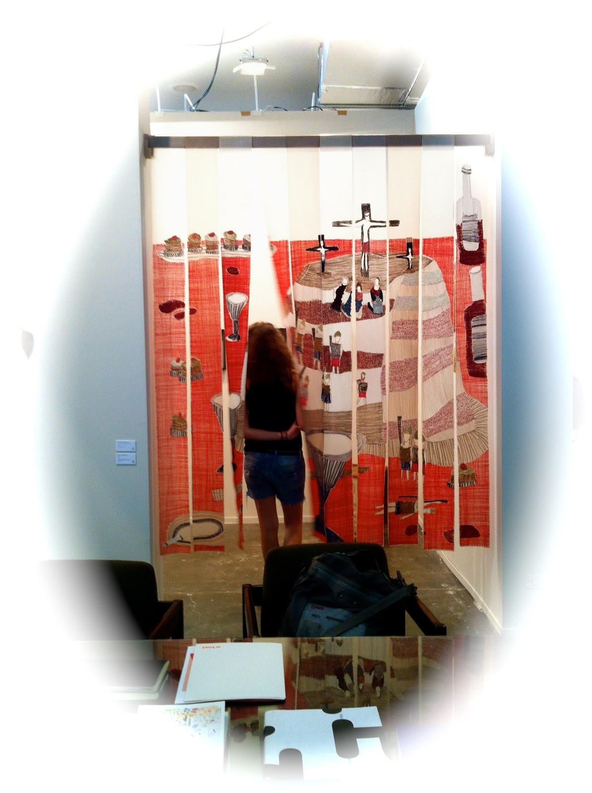
 This embroidery was so nice and well worked. I began to be interested in embroidery when I sew a work for my college portfolio. The work is about maternity, so I thought about sewing it, connecting the mother's coziness with the softness of the fabric.
This is my work:


Friday, April 5, 2013

Isabella Giobbi

It was thursday, 8:30 pm and Iguatemi Sao Paulo's C&A store was crowded of well dressed young women waiting anxiously to see the new collection launched by the stylist Isabella Giobbi.   C&A, fast fashion store known for its low prices and fresh tendencies just brought one more recognized designer to launch a collection, the same way H&M is famous for doing. It is interesting to see the way this kind of fashion fusion both makes C&A a more sophisticated brand and promote nice designs for a low price, making fashion more accessible. 

Known as the queen of yellow, as seen in all her clothe's labels and shopping bags, Isabella Giobbi launched a collection with tones of white, gray, black, yellow and touches of pink and orange. She used three different fabric drawings and also launched some of the clothes on a kid size, which you could see her daughter was wearing that very thursday.
I was surprised by the quality of the fabrics, since Amir Slama's collection for C&A had such a bad quality, the pink top I bought tye-dyed all my clothes in the washing machine the first time I washed it.  Isabella Giobbi's fabrics, in the other hand, were soft, sophisticated and delicate. It is certainly worth to buy on of her designs for a price in a range of R$ 60,00 to R$ 150,00 reais aproximately!

 
C&A store
the shoe I bought (the pattern under it is from an amazing dress of her collection which I also bought!)

the yellow pattern

another pattern

two of the kids's designs and a T-shirt


the citrus orange tone seen on some of the collection garments


the purses matched the drawings of the fabrics! (there was also a mini size for the little girls!)

 the mother...

 ...and the daughter


The yellow Shopping Bag

Tuesday, April 2, 2013

I am completely in love with the photos...

... I saw on Vogue enfants, Paris, 2013.


 It's a photo shoot from the photographer Andreas Sjodin that combines kids that looks more like actors because of their poses and faces expressions than kids. Also, the photo colors and the richness of the effects made me swear they were drawings, which leads me to... this painting I did inspired by the rich composition of colors I saw in the magazine.


 I used watercolor and colored pencils and was inspired specifically by this photo.